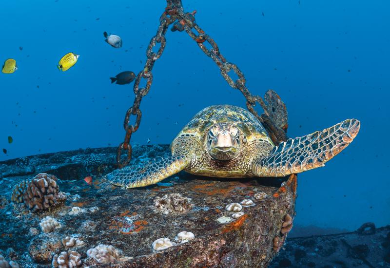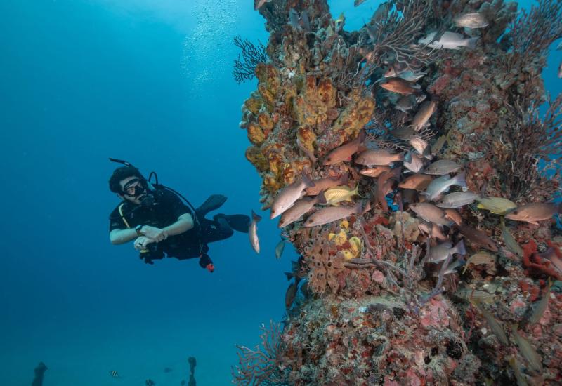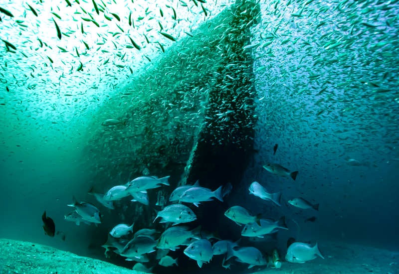
The Do's and Don'ts of Editing Shipwreck Photos
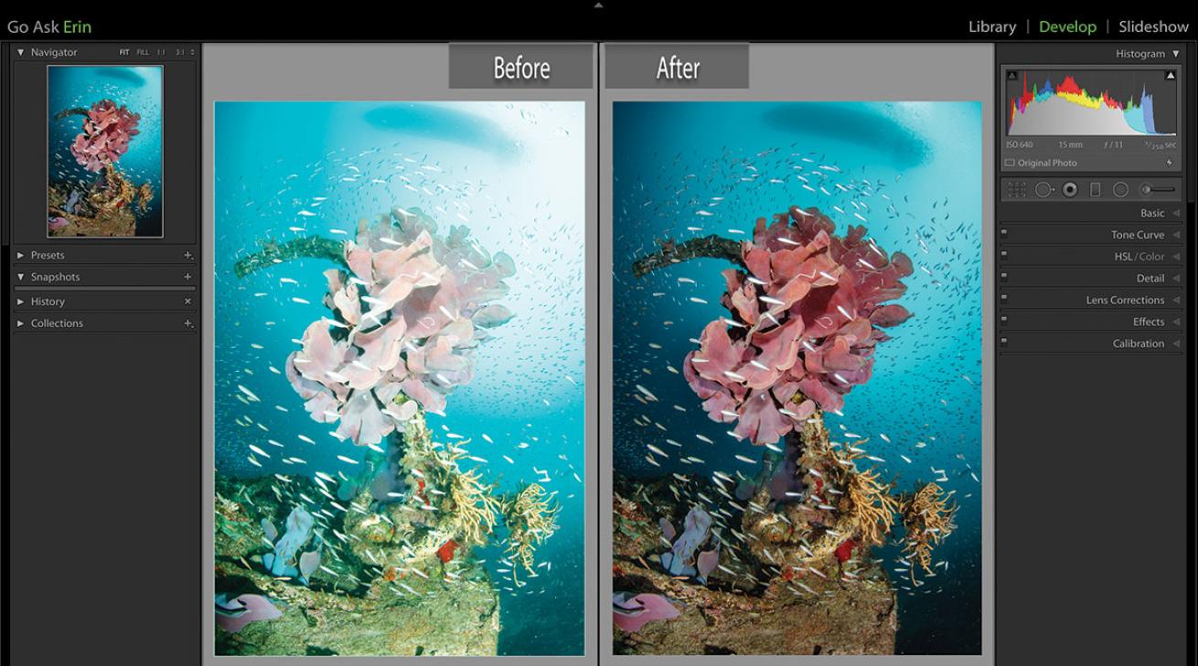
Erin QuigleyBefore and after.
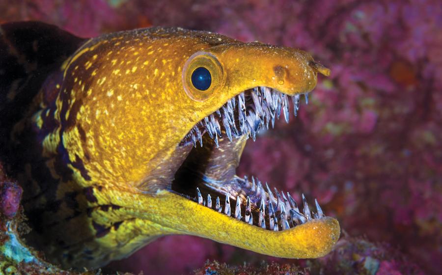
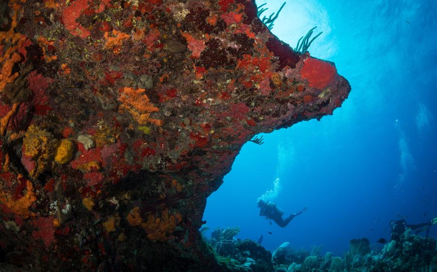
Moody or magnificent, wreck shots can be a real challenge to edit. Typically taken in less-than-optimal conditions, most wreck photos need help in post to achieve maximum impact. Lightroom and Photoshop offer an impressive array of tools to tease out texture and contrast, but missing the target while editing can sink even the most competently shot image.
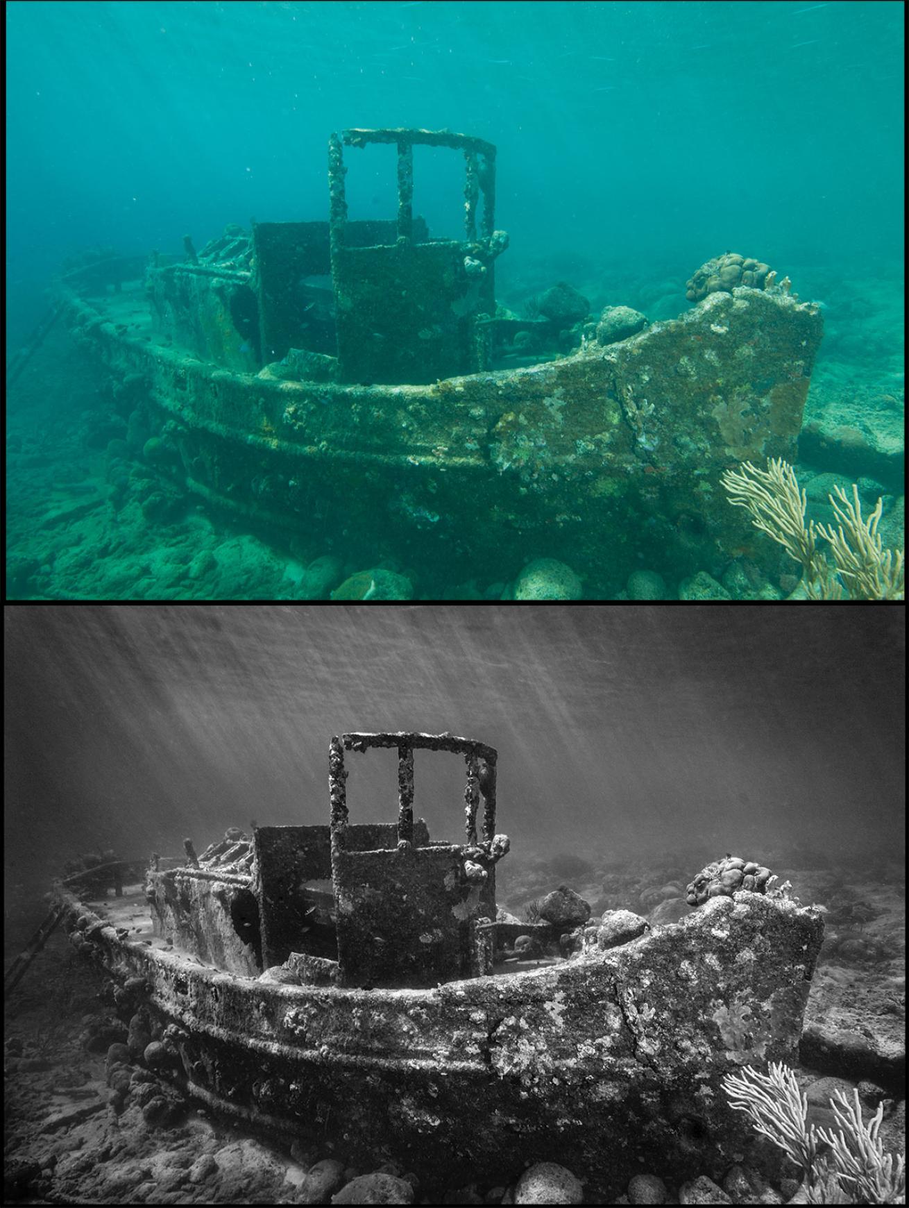
1) DO get a good white balance, even if you intend to convert to black-and-white.
The goal of white balance for underwater photographers is to render colors — particularly neutral colors — correctly: meaning, as they appeared to your eye in person when you took the shot. Our eyes are very good at judging what is neutral under different light sources because they automatically adjust, but digital cameras often don’t have the smarts to automatically make sense of the underwater environment.
Though the notion is counterintuitive, white balance has an important effect on black-and-white conversion. How we see color on the screen and how Lightroom interprets color are two different things. What looks blue to us might be numerically purple to Lightroom. This has significant implications when you’re trying to control how Lightroom converts the image.
Your initial white balance might make an ugly color photo, but it will ultimately make a better black-and-white conversion.
Erin QuigleyFig. 1: Before white balance (top), and after.
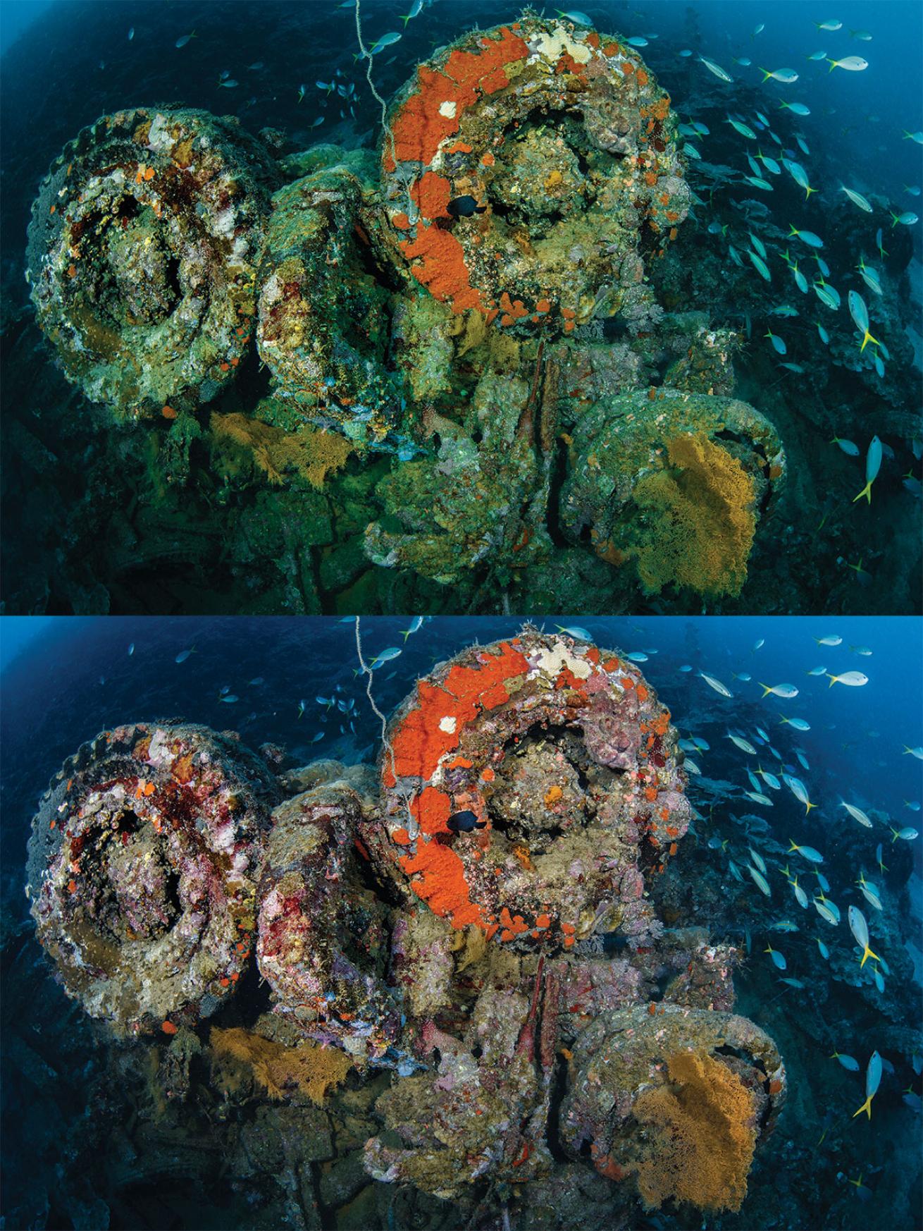
2) DON’T oversaturate.
I know, I know — everybody loves vivid color, but when saturation gets pushed to nuclear levels, not only does the entire image begin to look “worked,” but actual detail also is destroyed in areas where the color is out of gamut (printable range).
To avoid oversaturating, frequently check a before and after version of your image as you’re working. Seeing how far you’ve come can help you dial back how far you go. Two useful keyboard shortcuts for before and after views in the develop module are: backslash () for a single image view, and the letter “y” for a split screen before and after.
Friends don’t let friends oversaturate!
Erin QuigleyFigure 2.
3) DO embrace black-and-white conversion.
Wreck images make stunning black-and-white photos. If you’ve taken the picture using only ambient light, or if your strobes didn’t quite do the job, black-and-white conversion can quickly transform a lackluster photo from blah to ahhh.
Before converting to black-and-white in Lightroom, make a virtual copy of the picture. Virtual copies are not physical versions of images, so they take up no disk space. They simply provide a preview that looks and acts like a completely new original. You can make a virtual copy of any selected image by going to Lightroom’s top menu Photo>Create Virtual Copy, or by using the keyboard shortcut Command (Mac)/Control (PC) apostrophe (’). The virtual will appear in the grid view of the Library module next to the original image.
Erin QuigleyFigure 3.
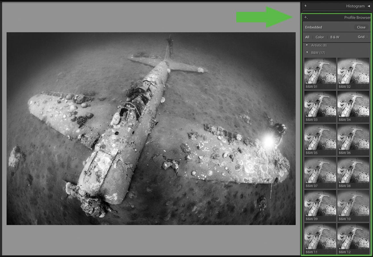
4) DON’T accept Lightroom’s default conversion as your final result.
The Adobe Monochrome profile that Lightroom applies automatically when you convert to black-and-white is rarely a good one. To select a different profile, click on the icon of the four little squares to the right of the profile dropdown menu, and roll your cursor over any black-and-white thumbnail to preview the conversion on your image. After choosing a profile, continue to finesse the image until you achieve the desired result.
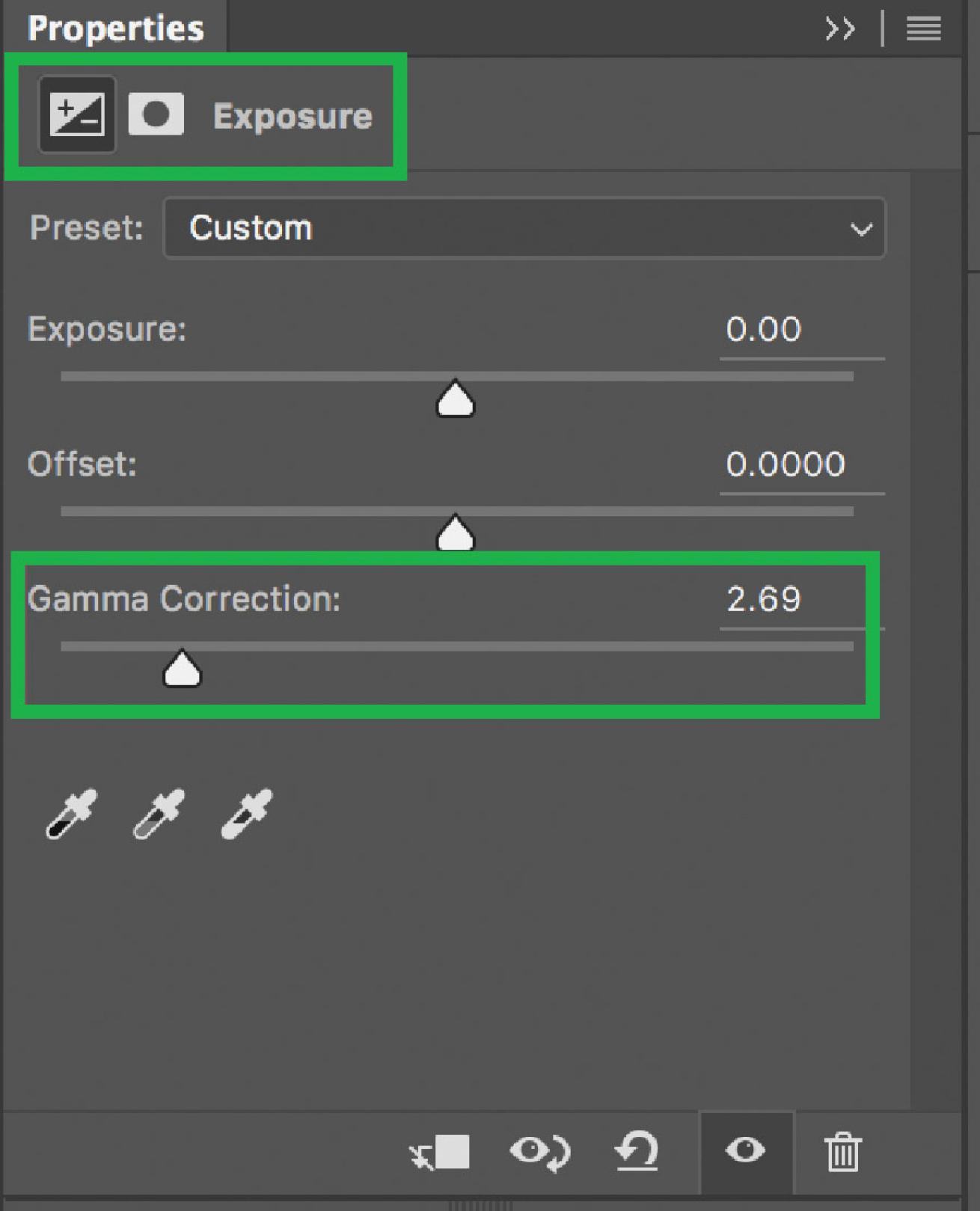
Erin QuigleyPro tip: To check your work for stray edits using Photoshop: Add an Exposure adjustment layer on top of the layer stack, and decrease the gamma slider. After repairing any problem areas, throw the Exposure adjustment layer away.
5) DO unify the photo’s grain structure after extreme editing.
If you’ve done any compositing, or significant backscatter, bubble or bozo removal, it’s important to unify the pixel structure of the image. Techniques for spot removal such as Content Aware Fill, cloning, and patching often leave blurred areas or blotches in their wake, and although it’s anathema to most photographers’ way of thinking, adding a little grain or noise at the end of the editing process helps to unify the image and hide any telltale signs of editing. To minimize unwanted post-processing artifacts in Photoshop, go to Filter>Noise>Add Noise, and click on the monochrome noise checkbox. Choose a slider value and experiment with the two options for noise — Uniform or Gaussian — until you get a result you like. In Lightroom, you can add grain in the Effects panel. I find that values of 9 for Amount, 9 for Size and 10 for Roughness do the trick in most cases. Don’t ask me why — it just works.
6) DON’T forget to check your work!
Whenever you retouch an image, you should check to make sure you haven’t left any unfinished or sloppy edits. Search your finished product at a magnification of at least 1:1 for artifacts and/or repeated elements, hard edges left over from compositing, obvious brush strokes, or edited areas that don’t match the texture of the rest of the image.